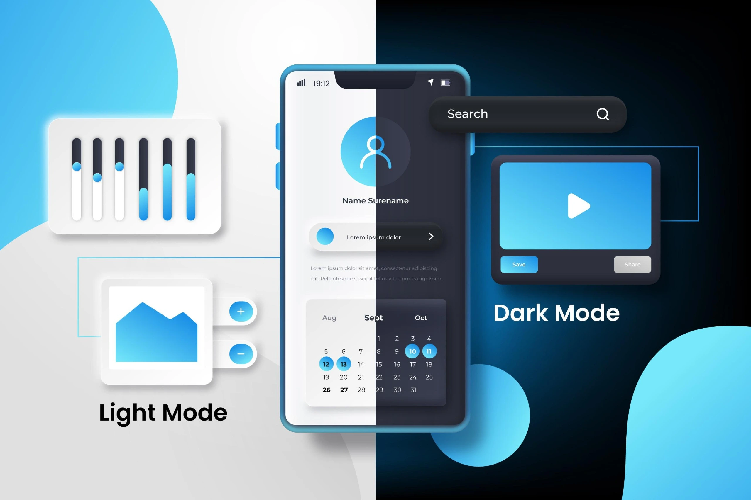
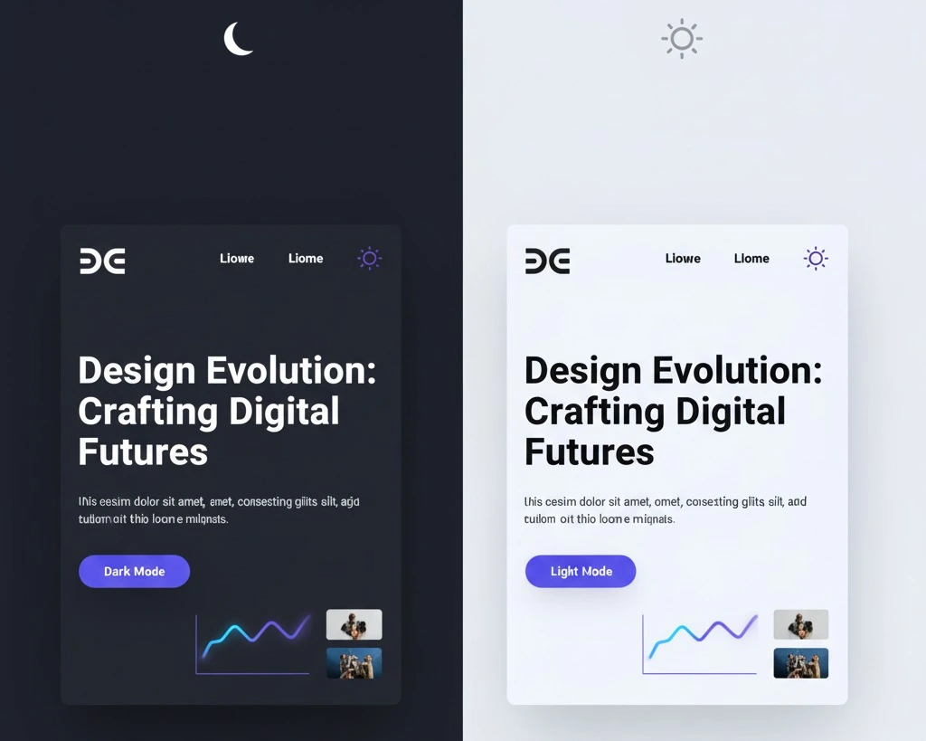
The Great Divide: Light Mode vs Dark Mode Website
The digital world is currently experiencing a visual revolution, one that changes the fundamental appearance of our screens: the choice between light mode vs dark mode website. What started as a niche preference among developers has surged into a mainstream user expectation. But for a business owner or a Website Design Company, this is more than just a fleeting trend. The choice between a bright, white canvas and a sleek, dark interface for your website can have a surprisingly profound impact on core performance metrics, from user engagement to search engine optimisation (SEO).
In this deep dive into the Light Mode vs Dark Mode Website debate, we’ll explore how your site’s color theme isn’t just about looking “cool”—it’s a critical element of your user experience (UX) and overall online strategy.
SEO’s Indirect Connection: Engagement is King
It’s a common misconception that Google’s algorithm directly penalizes a dark theme or rewards a light one. This is simply not the case. Search engine bots don’t have eyes and don’t care about your color preferences. However, what they do care about is user engagement.
Here is the vital connection:
- User Experience (UX) is a Ranking Factor: Google consistently prioritizes websites that offer a superior user experience. Metrics like Bounce Rate and Time on Page tell the search engine giant if users are finding your content valuable.
- Color Influences Behavior: If a user finds your website’s theme visually jarring, straining, or simply difficult to read, they will leave. A high bounce rate signals to Google that your content is a poor match for the search query, which can negatively affect your rankings. Conversely, a visually comfortable experience, whether light or dark, encourages longer dwell times and more page views—boosting those key SEO metrics.
Therefore, the question isn’t whether Light Mode vs Dark Mode Website is directly better for SEO, but which one creates a more sticky, comfortable experience for your target audience.
The Classic Contender: The Strengths of Light Mode
Light mode—the traditional dark text on a bright background—has long been the internet’s default for good reasons:
- Readability in Bright Conditions: In well-lit rooms or direct sunlight, the high contrast of black text on a white background offers the best legibility for the majority of users.
- Familiarity and Trust: For certain industries, such as finance, healthcare, and professional services, the clean, crisp look of light mode conveys a sense of trustworthiness and professionalism that users have come to expect.
- Universal Accessibility: Traditionally, light mode has provided a more universally accessible foundation, though this is shifting. Studies still suggest that for many users, particularly older demographics, the clarity of a white background can be easier to scan.
🌑 The Modern Marvel: The Allure of Dark Mode
Dark mode, with its light text on a deep grey or black background, is a rapidly accelerating trend—and not just for aesthetic purposes.
- Reduced Eye Strain in Low Light: This is dark mode’s primary and most celebrated benefit. For users browsing in the evening or a dim room, dark themes significantly reduce the intensity of light emitted by the screen, minimizing eye fatigue. This comfort can lead to a 25% increase in session length for some applications, according to user behavior studies, translating directly into lower bounce rates and higher engagement.
- Battery Efficiency: On devices with OLED or AMOLED screens (which is most modern smartphones), dark mode saves considerable battery life because black pixels are turned completely off. With mobile-first indexing dominating SEO, pleasing your mobile audience is paramount.
- Modern and Premium Aesthetics: Dark themes lend a sophisticated, high-tech, and often cinematic feel. For brands in the gaming, design, or tech space, dark mode can be a powerful tool for visual branding and appeal.
The Winning Strategy: Audience-First Design
Ultimately, the choice shouldn’t be a stubborn commitment to one side of the Light Mode vs Dark Mode Website debate. A truly effective digital strategy, often implemented by a forward-thinking Digital Marketing Agency, acknowledges that your users dictate the winner.
The Hybrid Approach: The best solution is increasingly becoming a hybrid model. Giving your users a clear, easy-to-access toggle button that allows them to switch between themes based on their personal preference or ambient lighting conditions is the ultimate form of customer service. This high level of control is the pinnacle of a great UX.
Before implementing any major design change, ask yourself:
- Who is my audience? (Younger, tech-savvy users often prefer dark mode; older demographics may prefer light mode.)
- What is my content? (Text-heavy content needs maximum contrast, while image/video-heavy sites often look more dramatic in dark mode.)
- What is my brand’s tone? (Is your brand ‘classic and trustworthy’ or ‘innovative and bold’?)
Consulting with an experienced Website Design Company or Digital Marketing Agency is key to running A/B tests that reveal which theme actually performs better for your specific site metrics. By focusing on accessibility, comfort, and user choice, you ensure your website’s color theme is a silent, powerful contributor to your overall SEO and engagement success.